Stradarium x MIF
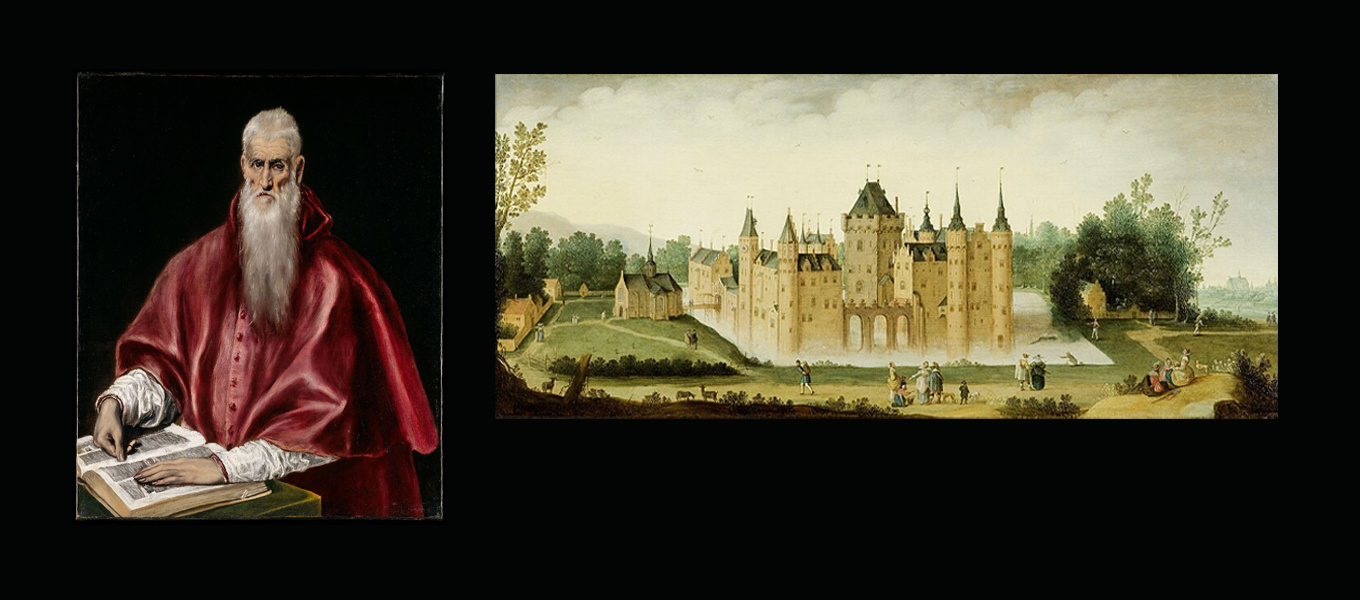
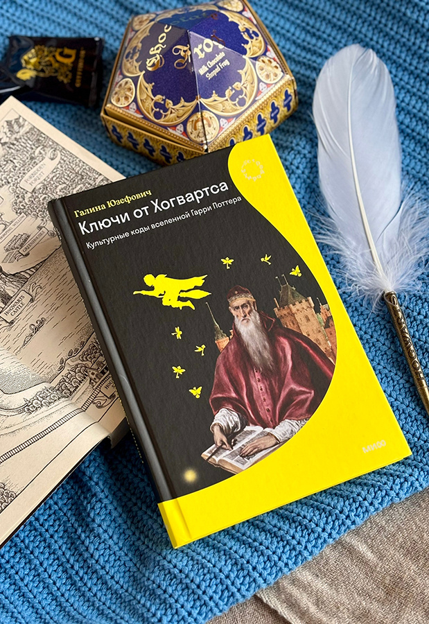
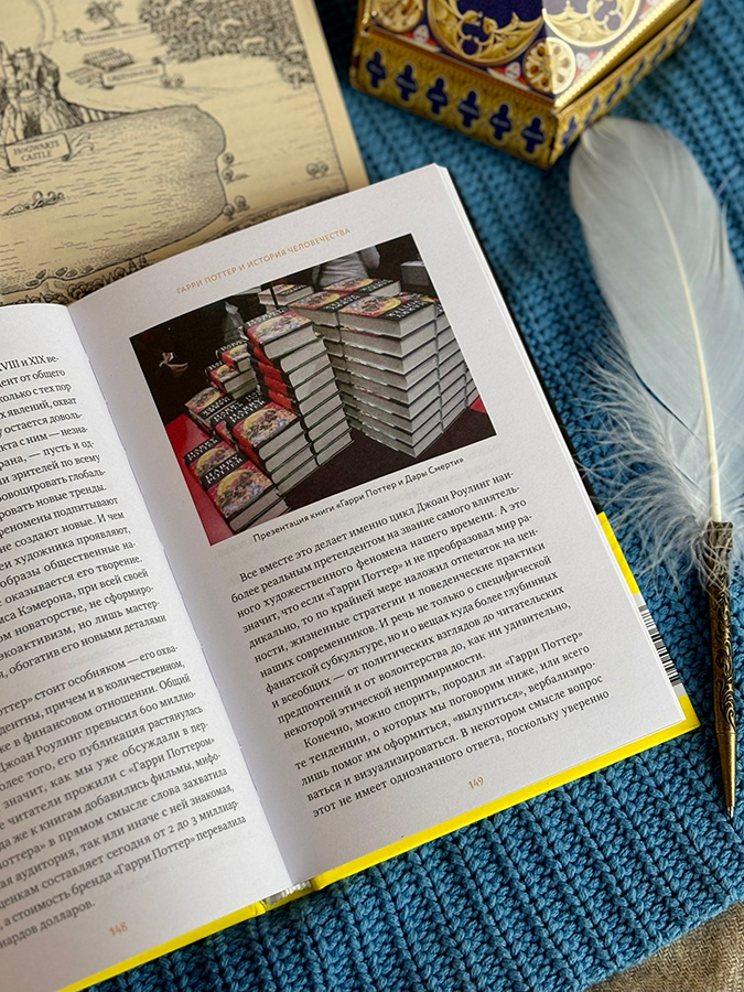
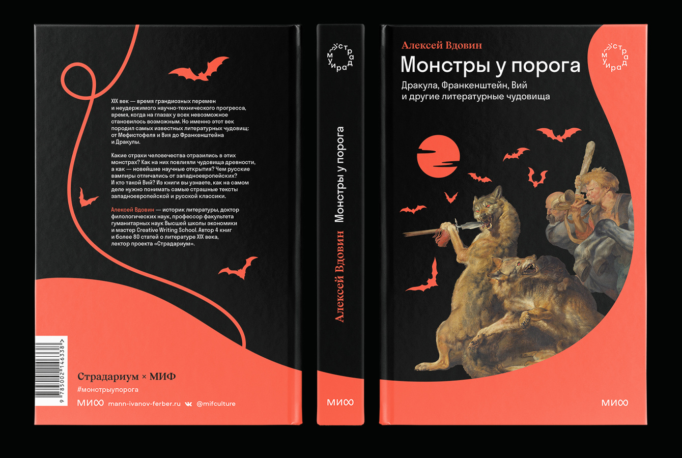
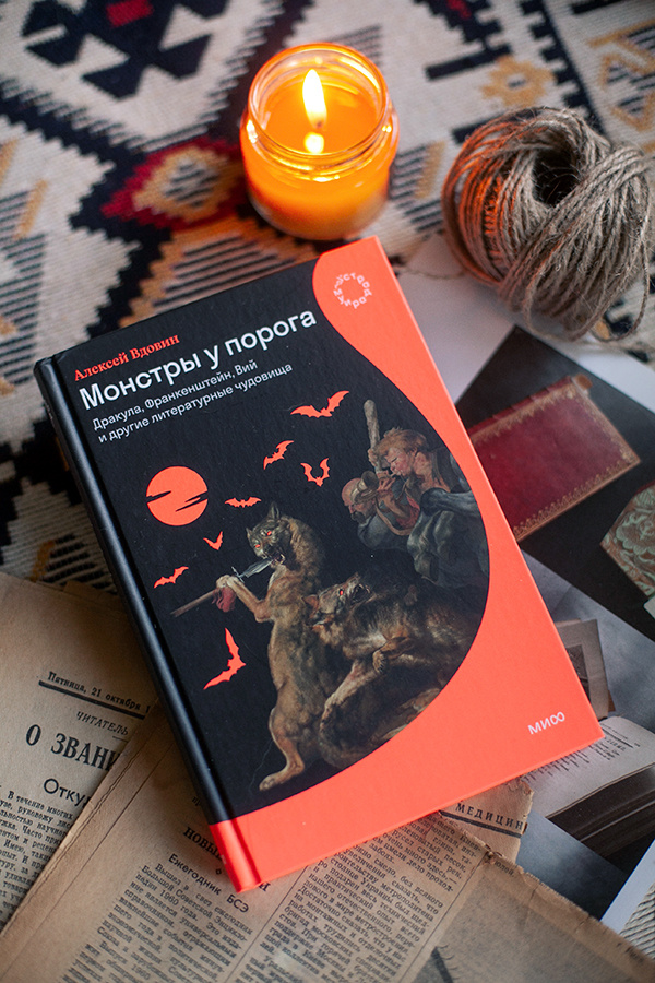
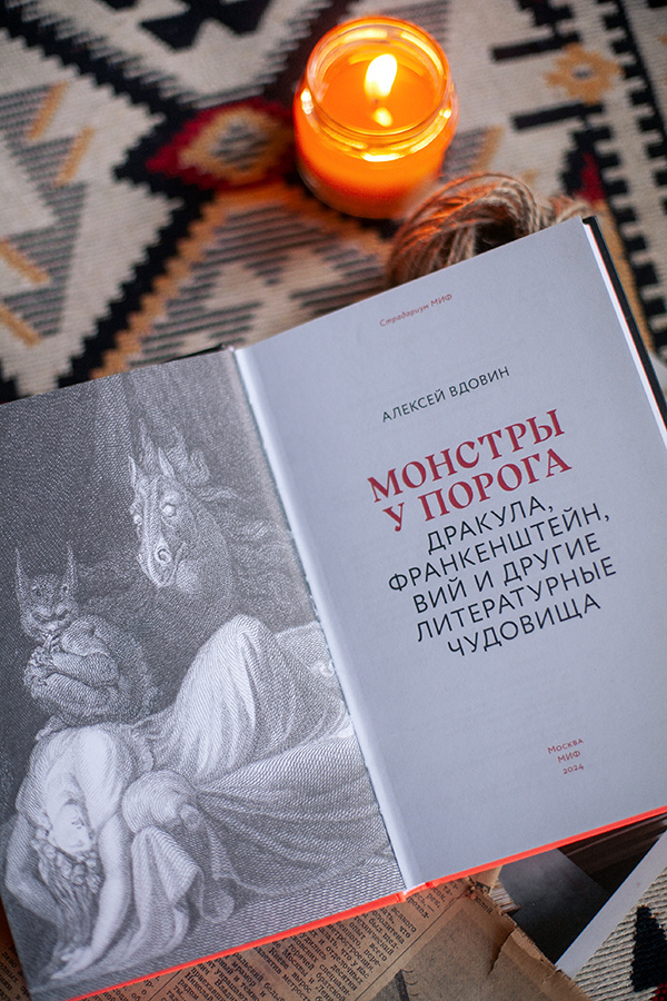
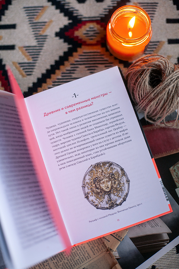
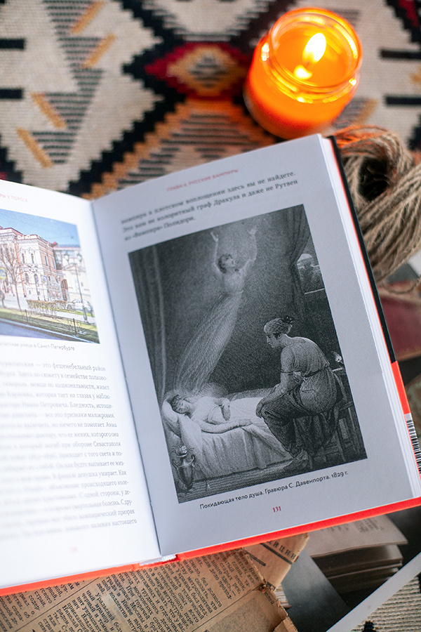
Stradarium x MIF is a book series created as a collaboration between Russian publisher MIF and the educational platform Stradarium, bringing together two established cultural brands through a shared visual language. The series explores a wide range of subjects across art, literature, history, and culture. The main visual challenge was to combine the recognizable aesthetics of both brands while creating enough flexibility for very different books and themes. A key part of the design process was the selection and preparation of artworks from the public domain. Finding suitable paintings in museum collections required careful research, considering not only the subject matter but also composition, color, image quality, and how each artwork could work within the overall cover concept. The selected images were then adapted and reworked through photo collage and digital retouching. The result is a series that combines historical imagery with a contemporary editorial approach, creating a visual connection between different subjects while preserving the character of both collaborating brands.
Series Design Concept
It incorporates the Stratos typeface for headlines and a color palette featuring neon orange and gray set against a black background.
Given the absence of existing print branding and the need to integrate with the “MIF” publishing house’s brand identity,
a number of systemic design decisions were made.
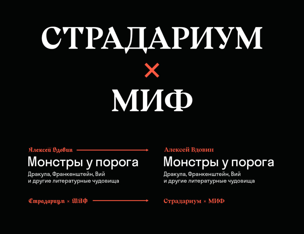
Replacing the display typeface
To preserve the medieval aesthetic while enhancing readability and appeal for the modern reader, the Shadower typeface was selected; it effectively highlights those same «Ustav» elements and characteristic medieval forms.

Color Schemes
Additional colors for future books were selected from the same palette and subsequently supplemented with other vibrant hues.
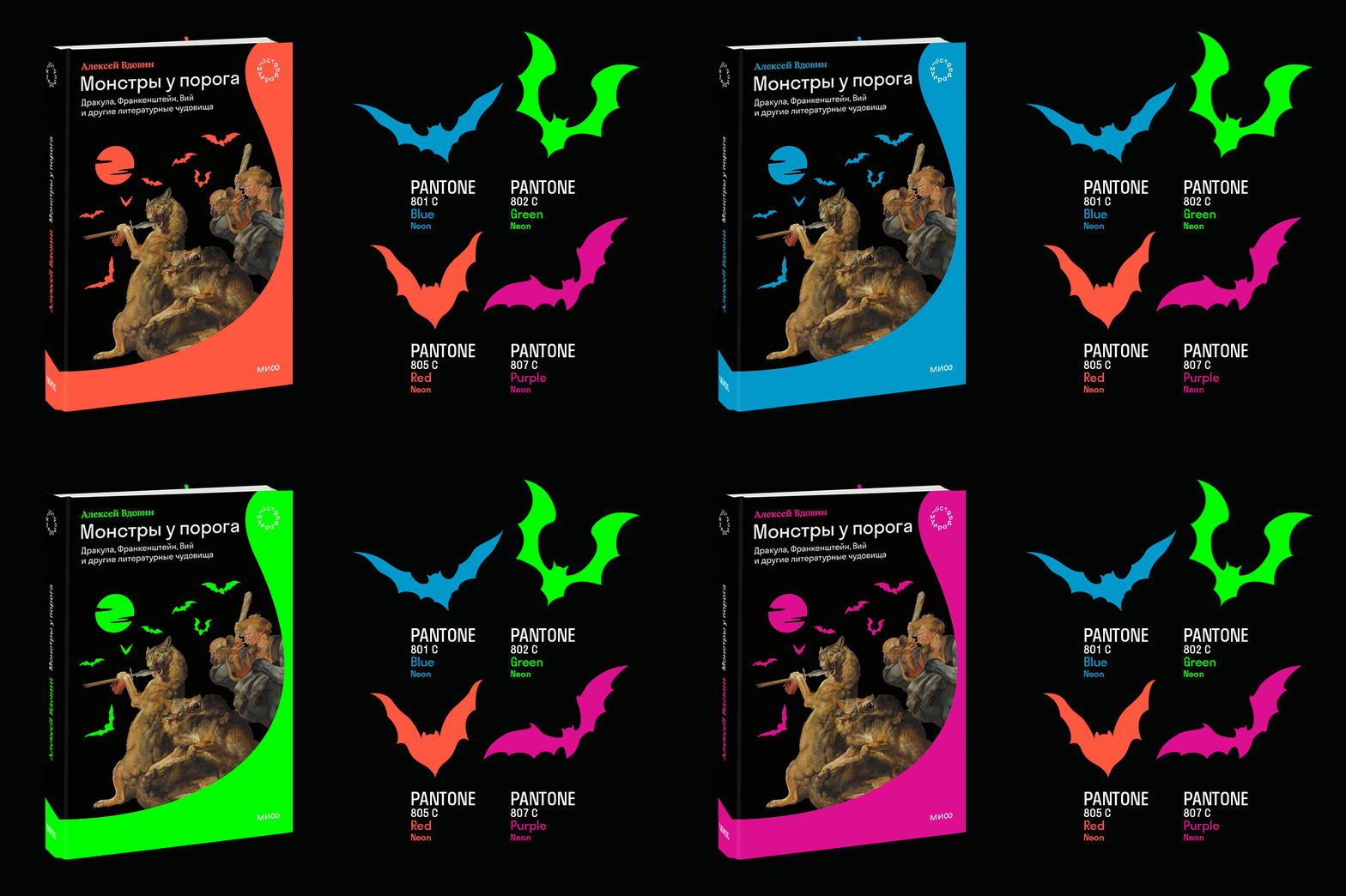
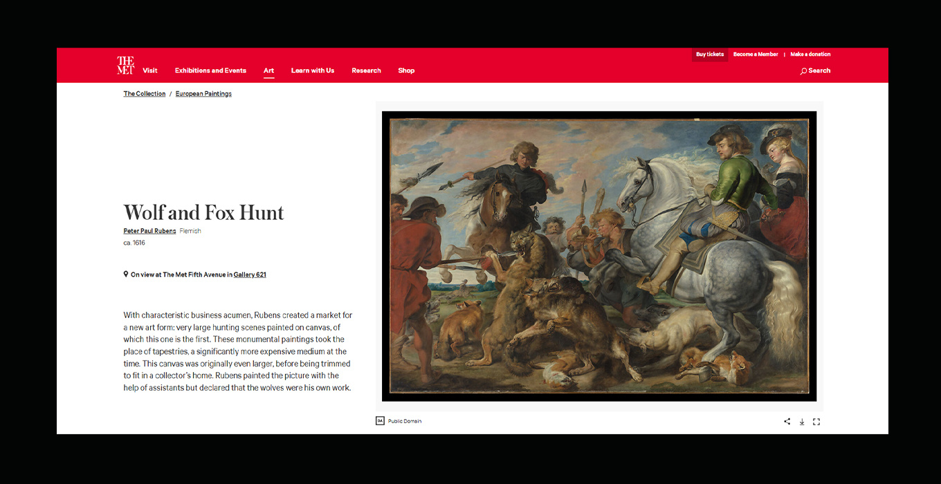
Image Selection
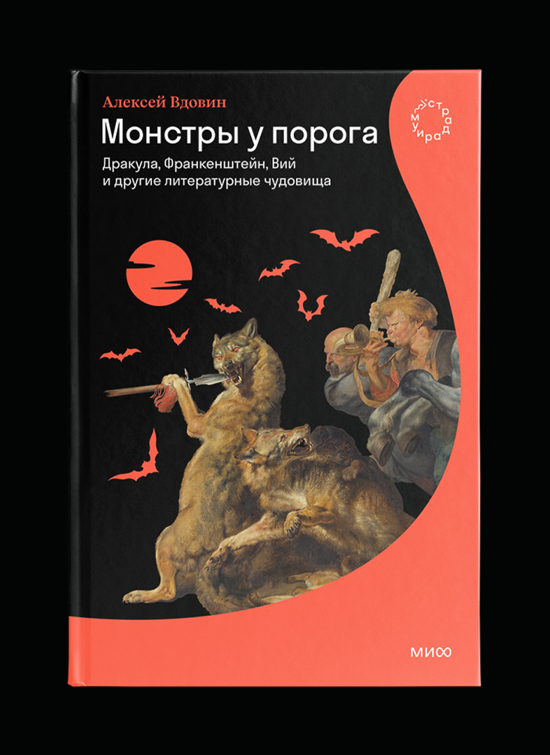
For the series’ first cover, the painting *Wolf and Fox Hunt* by the Flemish painter Peter Paul Rubens was chosen.
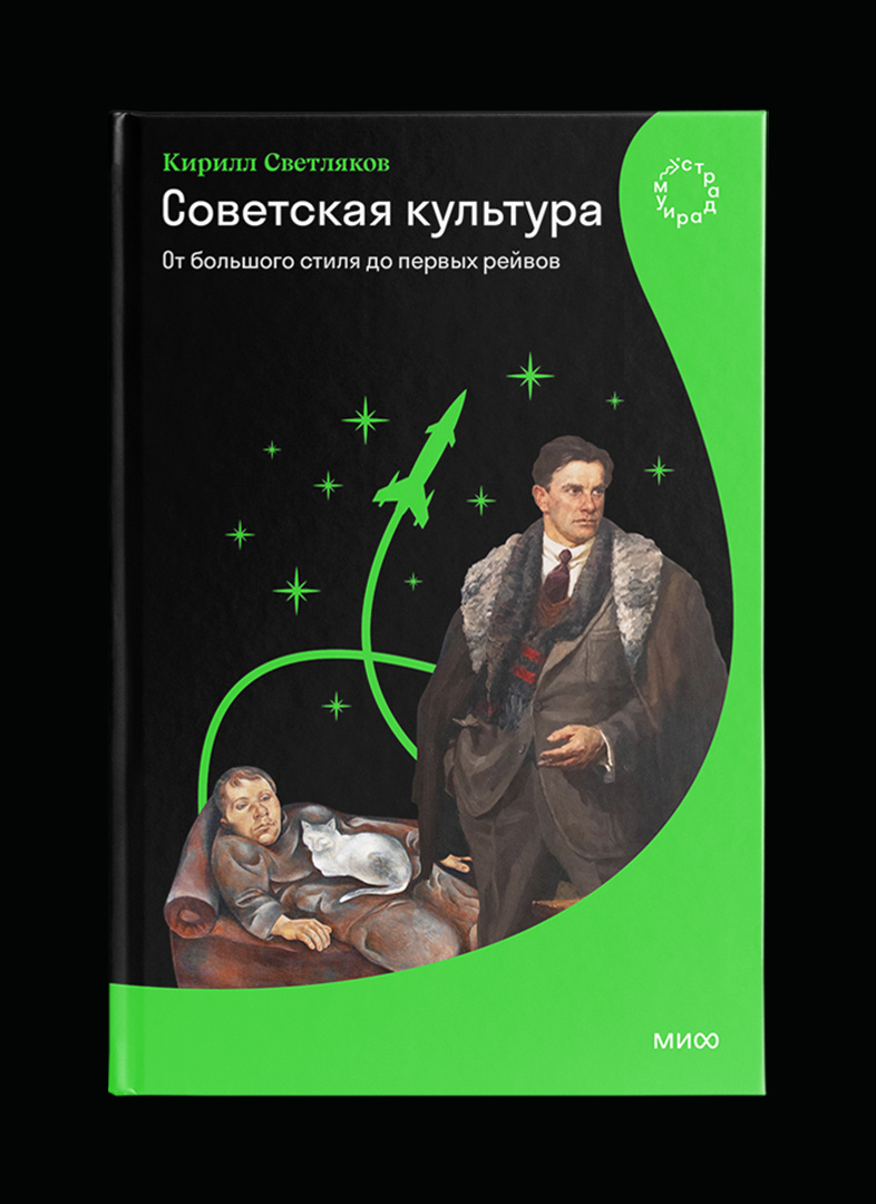
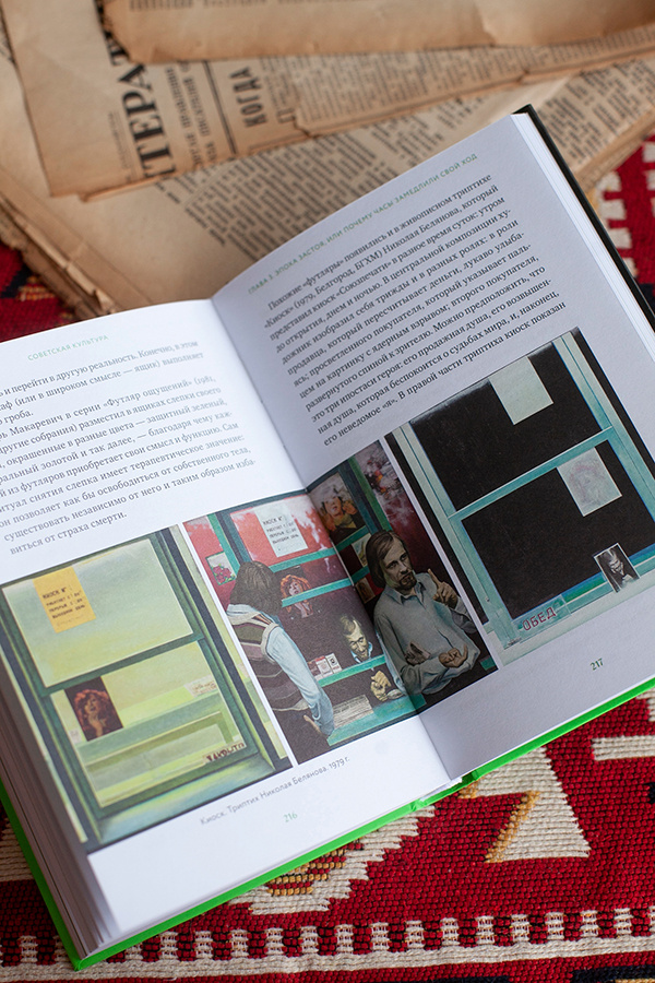
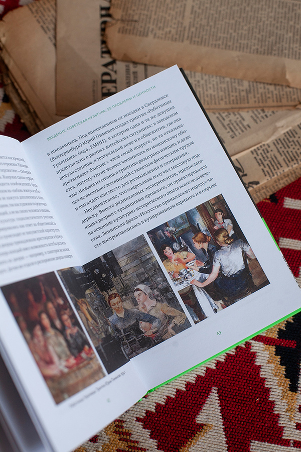
Soviet Culture
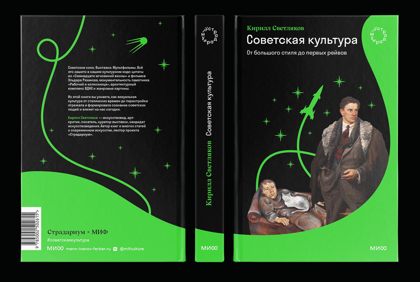
Image Selection
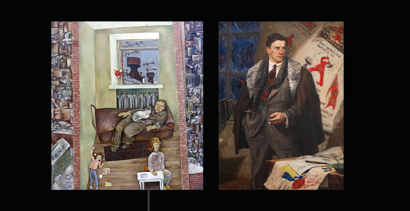
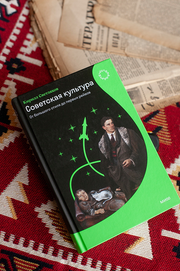
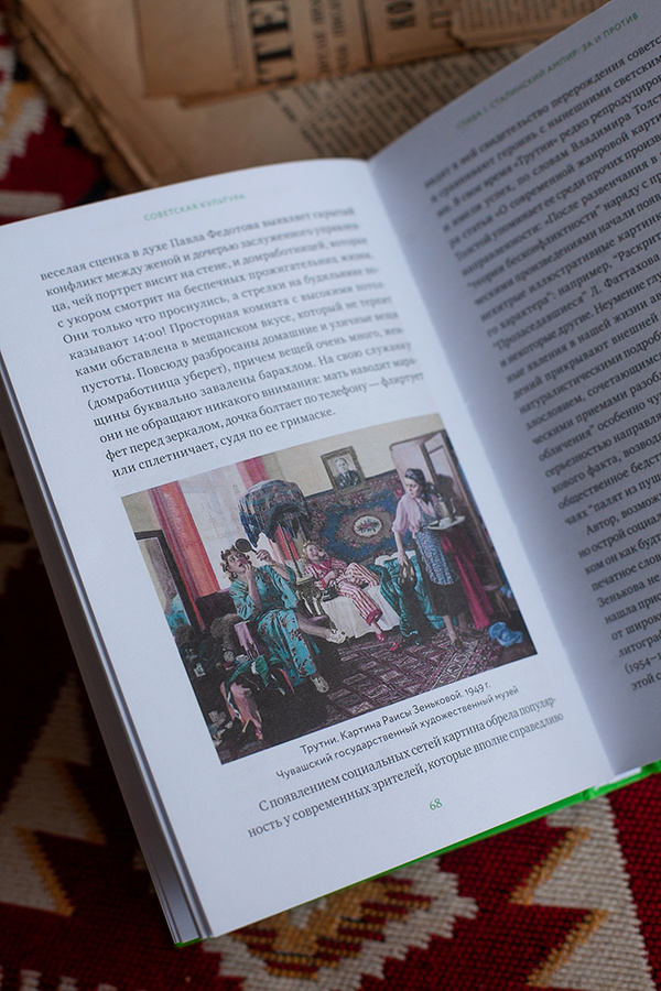
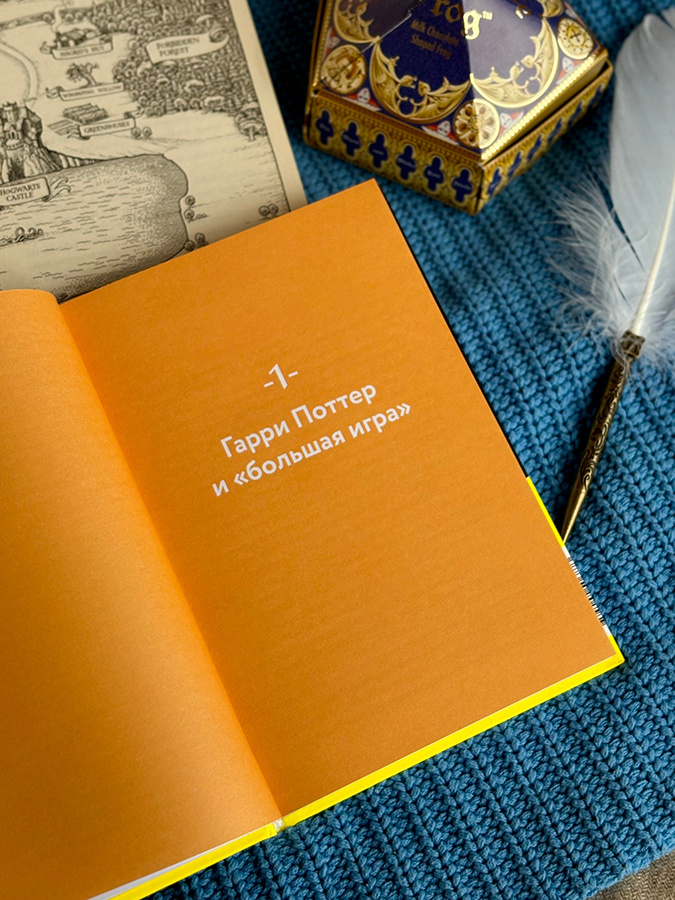
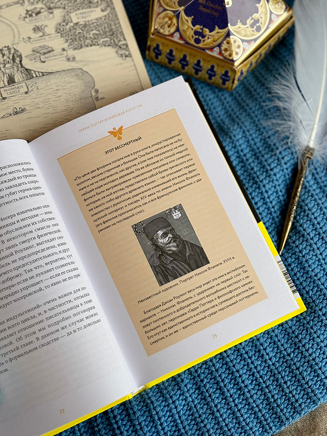
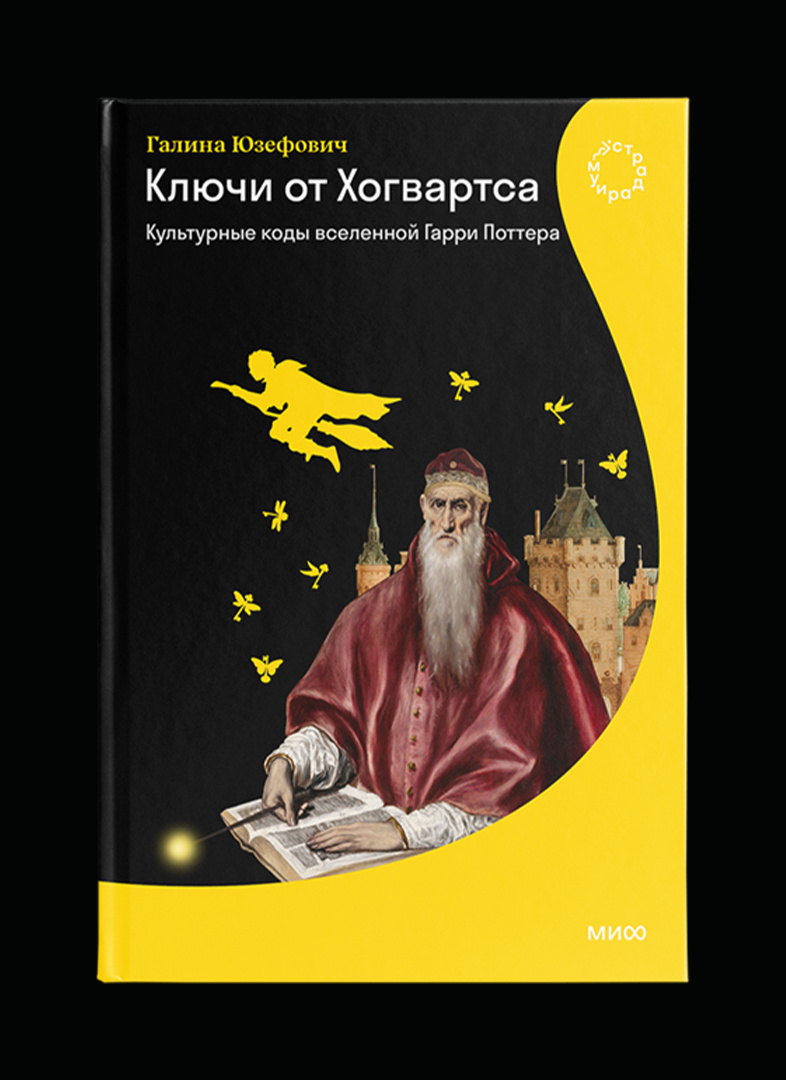
Keys to Hogwarts
We decided to create a stronger connection to the characters through the use of silhouettes.
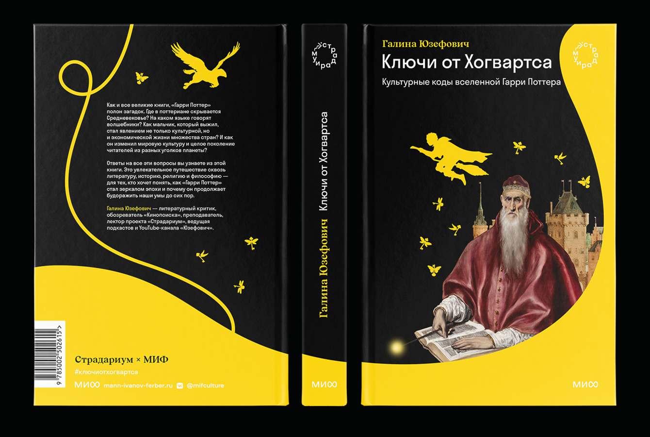
Image Selection